Brand refresh
The Crescent
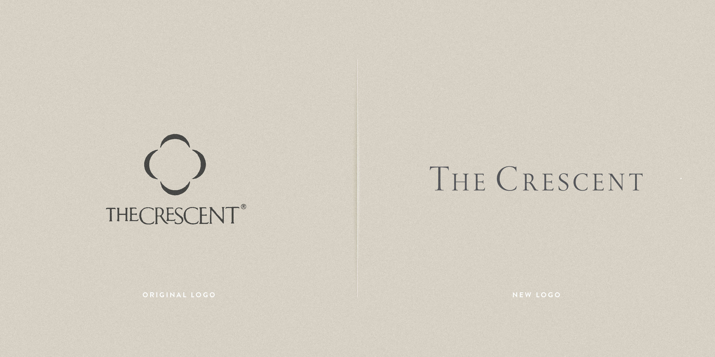
Designed by Philip Johnson and John Burgee, The Crescent is an iconic building in Dallas, Texas. It features a large office, dining, hotel, and retail complex. Crescent Real Estate needed to update the building’s identity but wanted to keep the legacy and tone of the old brand. The identity refresh was needed for corporate collateral, building and retail signage, and ultimately wayfinding.
The original logomark and the building’s neo-French classical design were revisited and referenced for potential brand elements. Seen throughout the Crescent grounds, the iron filigree was pulled and used heavily as a brand pattern. The attributes of the original logo were honored and revived with a timeless serif used to typeset the new logotype. The figures of the old mark were completely removed and used as elements for additional pattern. The buildings facade, landscaping, and surrounding structures influenced the updated color palette.


